- Lumos Marketing 💡
- Blog
- How to Optimise Your Website for Leads in 2025
How to Optimise Your Website for Leads in 2025
- Lumos Marketing
- July 14, 2025
-
- 0


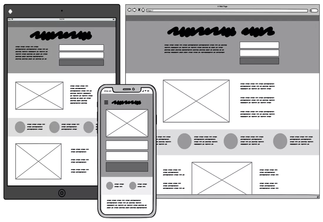
Your website shouldn’t just look nice—it should win you new business. In this blog, we’ll show you how to optimise your homepage and key pages to generate more leads without redesigning your entire site. We’ve also included a downloadable Homepage Optimisation Cheatsheet to make implementation even easier.

Why Website Optimisation Matters for Lead Generation
In the digital-first world of 2025, your website is more than just a digital brochure—it’s your hardest-working sales tool. Visitors form an opinion in seconds, and whether they stay or leave often comes down to how clearly your value is communicated and how easy it is for them to take action. An optimised site doesn’t just look good; it guides your visitor from interest to conversion with minimal friction. If you want your homepage to generate more leads, you need to move beyond aesthetics and focus on strategy.
Step 1: Clarify Your Value Proposition
Your value proposition is the foundation of lead generation. It should answer three key questions instantly: what you do, who you do it for, and why it matters. For example, if your headline simply says “Welcome to Our Website,” you’re missing a critical opportunity to connect. Instead, try something like “Affordable, Fast-Loading Websites for UK Startups Ready to Grow.” This immediately frames your offer and shows your visitor that they’re in the right place.
Your message should be front and centre, ideally positioned above the fold alongside a compelling subheading and a primary call to action. This trifecta ensures your visitors have clarity from the start, setting the tone for the rest of their journey.
Step 2: Simplify Your Website Navigation
Think of your website like a shop—if customers can’t find what they need, they’ll walk out. A common mistake is overloading the menu with too many options, confusing jargon, or poor organisation. Instead, keep your main menu simple and predictable: About, Services, Work, Contact. Limit it to 4–6 essential items to help visitors navigate effortlessly.
Navigation isn’t just about menu labels; it’s about flow. Guide users toward your primary conversion goal by ensuring your key CTA (like “Book a Free Call”) is visually distinct and repeated across key areas. A smooth, intuitive user journey boosts trust and keeps potential leads engaged longer.
Step 3: Add Clear Calls-to-Action
Every page should guide your visitor to do something next. CTAs act as signposts pointing users toward taking action. Unfortunately, many websites bury their CTAs or use language that’s too passive. Phrases like “Learn More” are vague. Instead, say exactly what the user gets—”Download the Free Guide,” “Book a Free Strategy Call,” or “Claim Your Offer.”
Your CTAs should be consistent in style, visible without scrolling, and tailored to the stage of the buyer journey. For example, a homepage might offer a quick-win download, while a service page encourages booking a consultation. Placement matters too: feature CTAs in your hero section, after describing key benefits, and in the footer for those who scroll to the end. Don’t be shy—repetition increases response.
Step 4: Use Social Proof Strategically
People are naturally hesitant online, especially when dealing with unfamiliar brands. Social proof helps overcome that hesitation by showing that others have trusted you—and got results. This could include testimonials from satisfied clients, ratings from review platforms, logos of companies you’ve worked with, or even statistics that showcase your reach or impact.
A well-placed testimonial can significantly improve the performance of your CTAs. Place these confidence boosters near key actions—next to forms, below pricing, or within landing pages. Aim for quality over quantity: specific, relevant quotes with photos or videos will always outperform generic one-liners.
Step 5: Capture Leads Without Being Pushy
Lead capture should feel like a natural next step, not a demand. If you’ve offered value and clarity, visitors will be more willing to share their details. But timing and method matter. Use sticky bars for low-friction opt-ins, like “Get Our Free Cheatsheet.” These are subtle but effective and always visible.
Exit-intent popups can recapture attention from users about to leave your site—especially if paired with a valuable freebie. For the majority of lead capture, embedded forms work best. Place these at the end of blogs, on pricing pages, or inside landing pages. And remember, shorter is better: ask only for what you need to start the relationship.
This is where your Homepage Optimisation Cheatsheet plays a key role. It gives visitors a quick win and positions your business as helpful and resourceful from the first touchpoint.
Bonus: Track & Tweak for Better Results
Optimising a site is never a one-and-done job. The most successful small business websites are those that evolve based on real data. Start with free tools like Google Analytics 4 to understand how people interact with your content. See where they drop off, which CTAs get clicked, and what pages convert best.
Then layer in Hotjar to get heatmaps and user recordings that show what users are doing—not just where they click. If your CTAs aren’t converting, try testing a different message, changing the button colour, or moving it higher up the page.
Even the words you use matter. Run your copy through Hemingway Editor to simplify clunky language and make your message more direct. Small tweaks—like changing “Contact Us Today” to “Book Your Free 15-Minute Call”—can have a big impact.
Frequently Asked Questions
Below, we address common concerns to ease your worries and help you plan confidently, building on the insights above.
What’s the biggest mistake small businesses make with their websites?
Focusing on design over functionality. A beautiful website is useless if it doesn’t help you get leads. Lead generation requires strategy, not just aesthetics.
How quickly can I start getting more leads from my site?
If you already have some traffic, small changes to your CTAs, layout, and messaging can deliver noticeable results within a few days to a few weeks.
Do I need a full redesign to optimise for leads?
Not necessarily. Many businesses see excellent results from small, smart adjustments to copy, structure, and calls-to-action. Full redesigns should only come after you’ve tested your current layout.
Can Lumos help with this?
Yes! We offer website audits, homepage refreshes, and full lead generation setups starting from just £300. We believe great marketing should be accessible to startups and small businesses.


