Yuvira Wellness – Yerba Glow
CATEGORY :
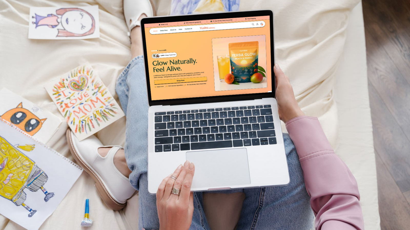
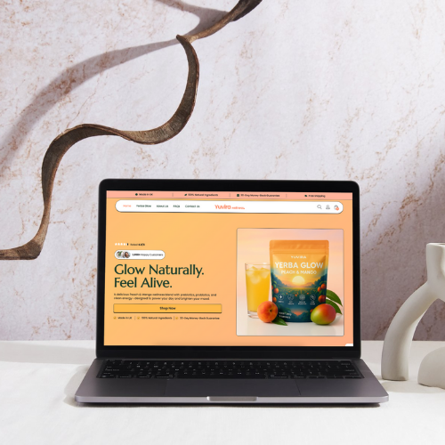
Website Red Design
YEAR :
2025
Project Information
About Yuvira Wellness
Work Overview
Designing a one product store around the customer’s decision journey
Instead of building a standard “home, shop, about” structure, we started with one central question: what does someone need to see and feel before they click “add to cart” on a new wellness drink?
We mapped that journey into a long form product page that:
Introduces the problem and desired outcome
Presents Yerba Glow as a simple, daily solution
Breaks down the ingredients and benefits in plain English
Uses social proof to show real people using the product
Handles objections through FAQs and trust markers
Ends with clear, simple purchase options
Around that, we kept the rest of the site lean. Instead of ten different distractions, everything flows back into this hero product. The design, copy and layout all push visitors towards one action: trying Yerba Glow.
The Challenge
Launching in a crowded wellness market
Low trust in wellness claims
Visitors had already seen dozens of “miracle powders” online. If the site felt too generic or hype driven, they would leave instantly.
Complex formula, short attention spans
Yerba Glow packs a lot into one blend. Pre and probiotics, green tea caffeine, vitamins and more. Explaining this without overwhelming people was a key challenge.
No clear funnel or brand story
Early tests showed that visitors were landing on the site, scrolling randomly and leaving without buying. There was nothing guiding them through the story from first impression to checkout.
The Solution
A focused, story driven funnel for a single hero product
Custom single product WordPress layout designed for conversions
On page SEO for wellness and product related keywords
Mobile first performance optimisation for paid and social traffic
Email capture and basic automation integration for follow up offers
Social media templates to keep the brand consistent across platforms
“A page that finally tells the same story we tell in person.”
“We always believed in Yerba Glow, but the early versions of our website never quite explained it properly. Lumos helped us turn our product into a clear story, with a page that answers questions before people even ask them.
The new store feels premium, loads quickly and converts far better than what we had before. It has given us the confidence to push harder on marketing because we know the landing experience is solid.”
– Founder, Yuvira Wellness